Project Spectrum
Last year I didn't join because I stupidly thought it meant only knitting with purple for August. Or whatever. I hate purple, by the way. I love violet and raspberry and aubergine, but I dislike the blue-purple "I'm 9 and not afraid to say I don't like PINK" colour. The princess purple. Ick. The lavender tulle of Disney dresses and Limited Too clothes is like a Jen-repellent. You know, THIS purple. I much prefer warm colours, warm lavender (like the real thing) and warm grapey hues.
Colour is just unlimited fun and interest for me. I love that I can see colour better with one eye than the other (you can too, probably). I love the logic of a colour wheel and how beauty can be very structured and logical - two colours that are matchy-matchy with a little surprise of something else makes me happy. When I'm in a bad mood, I wear bright colours. When I'm designing at work, I wear happy, bright and fun colours. Colour affects mood. It reflects up on your face and makes you look happy, tired, energetic or washed out.
So I like it. And the project spectrum colours scared me - blue and gray? Civil war colours? Every colour carries both mood and connotation, and the connotations of these two for me - sky, ocean, military, machinery, modern box-shaped boring architecture, Tiffany's and the lot just didn't seem to have anything in common for me. I could literally not think of any more boring colour combination than blue and gray together. I don't care if it's stormy skies and sunshine - I just could not get into it.
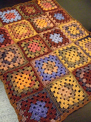
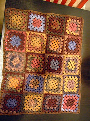
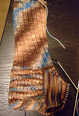
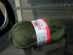
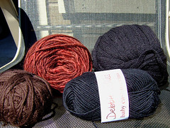
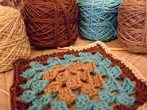
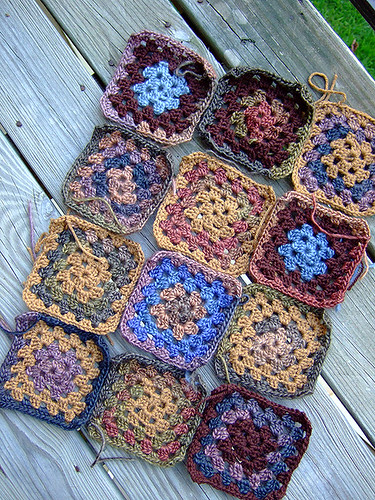
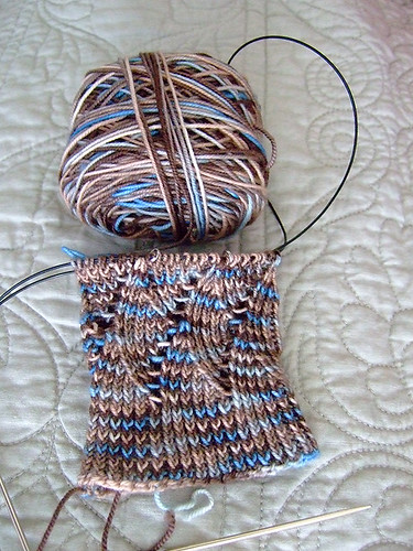
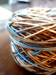
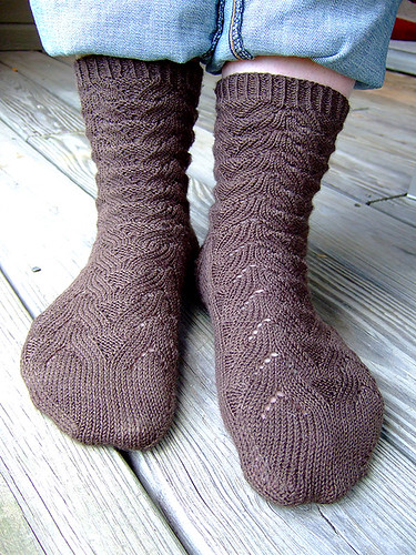
What I didn't realize was that instead of going into shutdown mode, those clever little fellows who live in the back of my brain and occasionally send up ideas (which are, luckily, usually good ones) have been sending up little flares of ideas for about four weeks. I started to realize - my Calorimetry is a stormy ocean blue. The bunch of t-shirts I just got at Old Navy? Blues. My favourite Crane's paper stationery? Cream with a tiffany blue border. New jeans? Light blue. Crochet granny squares? Neutrals and throw in a bit of blue. Lucy socks? Blue and brown - a neutral. Grannies 2.0? Blue and brown. The Elsebeth Lavold Silky Tweed I just pulled out of the stash for some Endpaper Mitts? Blue and brown.
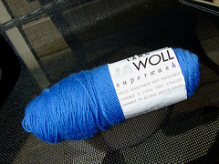
I realized I do like warm blues, and I especially like warm, bright blues combined with a neutral (brown) right now. I know brown isn't on the official list of PS colours, but I think because I see so much of it - jeans, sky, cars - that blue became quite boring to me. I've never been bored with snowy, icy, iron-y, bleached-wood greys. Gray to me is one of those comically underappreciated colours because so many BAD grays are used. But if you really look at steel, at the slight blue undertone that makes it seem cool and strong at once?
Nature doesn't use a lot of gray. I often say it's amazing that God created so much beauty that is disposable. Leaves and flowers fall off trees and get trampled, grass dies, a sunset is only good for an hour or two. Every creature and created thing comes to an end, but that didn't stop Him from making things almost recklessly beautiful. How many days could I work, with unlimited time and budget, and never come up with something to equal the beauty of what God does every night at sunset? I know there is a scientific explanation for it, and I don't care - many people think music is the highest human form of worship. For a non-musical, visual person like me, a sunset carries much more worship potential for reflecting on the beauty and perfection of God. One of my favorite bible verses is Jeremiah 32:17 - Ah, Sovereign LORD, you have made the heavens and the earth by your great power and outstretched arm. Nothing is too hard for you.
So, gray. Not a lot there. I love gray but it hasn't been speaking to me lately. It's one of the colors of twilight, of death, of winter. It can be comforting, cool, and safe as well. Add yellow to a gray and you warm it up. Add a little red on top of that and you get brown. So I went with brown as a foil for my blues. I'm happy with that. I'll try to collect some photos of what I am talking about colorwise.
Take today to reflect on how much beauty surrounds you. If it doesn't, take the time to make something beautiful with your hands or needles. Stop and really look at the yarn you're knitting with, and marvel that it came from a sheep, or a cotton plant, or a piece of bamboo. Try to notice some details you haven't before, and get a little lost in the process of just looking.
You might be inspired! Thanks for listening to me.
Labels: Christianity, knitting, Project Spectrum, theology

