I was just feeling better, too...and now I've got more sniffles, more achies, and more feeling like crap in general. Hopefully it will only last a day or two.
Last night I fell off my chair during Stitch-n-Bleep (it really is called that now, hehe) in front of
quite a
few people
you probably
know and a lot of other people I can't find blogs for. It was a perfect slow-motion slide off a plastic folding chair compounded by a hole that has been wearing into the cuff of the jeans I was wearing for quite some time - yesterday afternoon when I put them on I noticed the cuff was now looking more like stirrup pants than my beloved Gap Long & Leans. The stirrupy part on my left foot was caught under my shoe, I started to answer a question and slide at the same time, my feet couldn't stop me because of the fabric, and down I went.
Thankfully I have some padding back there, so it didn't hurt. But wow, I'd have to say that's a first in my "embarrassing things I have done" lexicon, and we all already know how
rich and varied that is.
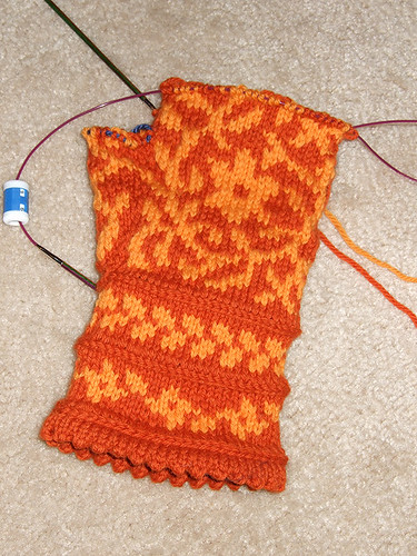
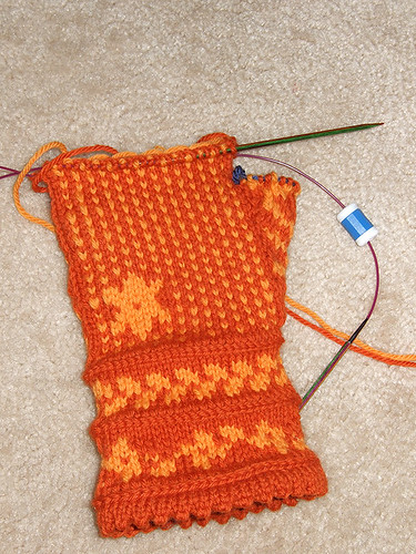
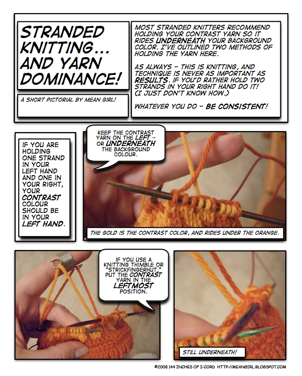
I bought some Cascade 220 to make those pretty
Kate Gilbert mitts - a lovely paprika and a lovely gold. One of the things about traditional stranded knitting that gets on my nerves is colour. I don't like navy, evergreen, burgundy or any of the deep colours that are traditionally used as a foil for the snow-white or off-white yarn in these patterns.
Rule of thumb (ha ha): You need a sufficient level of contrast to make a stranded pattern work. Not necessarily white-and-black, but there definitely needs to be at least two or three shades' difference between your mc and your cc for it to work so anybody else can see the pattern.
Rule of thumb two: The more closely related the colours are, the more subtle the final piece will be. In other words, shades of orange and gold will make a stranded piece - orange and gold! - ok, seriously, these colours are next to each other on the wheel, and if you squint at them, they will become one. Stranded knitting made from them will not be bold and graphic. A light and a dark blue will do the same if they are the same tone but about two steps apart. But use a baby blue with a navy (ugh, don't do this) and you'll have plenty of contrast. So one way to provide contrast is through using different shades of the same tone.
If you additionally want tonal contrast - where not only are your shades different, the colors themselves have some punch against each other - you must pick colors that stand across from each other (or at thirds) on the
color wheel - orange and violet and lime green! Or try orange and black! (Black gives contrast to anything except the darkest colours.) Gold and persimmon! Teal and gold! (An awful lot of sports teams seem to use contrast by picking silver, gold or white and matching it with a bright colour. You can do this as well. Sometimes it's easier to start with the contrast colour and find an appropriate ground for it.) So that navy I was ugging about - you could try it with a melony green, with cantaloupe, with butter yellow, with white. Then you've got tonal contrast and value or shade contrast working at the same time. (But also try it with a bright plummy pink and white!)
Overall, the more contrast, the more drama you'll have. Cooler colors will appear more formal, and warmer colors...well, warmer. (Note to anyone doing makeup for a formal party: this is the time to break out your silver or navy eyeshadow. Cool colors! More contrast! Black eyeliner! Very formal.)
Rule of thumb three: If the colors vibrate in the skein (that is, they hurt your eyes to look at together), they will do that in your knitting. Just sayin'.
More on color tomorrow.
There really aren't any rules. Go have fun. It's just knitting! Knit what you love.
Be honest: how many balls of yarn do you have kicking around that you bought because you REALLY wanted the red, but thought you probably had too much red already?
Anyway! Happy Friday!

