I. Cropping
Today I am going to talk briefly about one of the elements of composition. (Hopefully briefly.) I have a lot to say about these subjects and I almost never talk about my work, so I may run on way too long.
Composition is the art of making a pleasing arrangement in your photographs. There are certain rules to follow, more or less six or eight of them that will really help you in a practical way. I'll get to the others eventually as I have time to shoot sample shots. Tonight we are talking about Cropping.
Cropping is sort of a way of framing your shot so that only the most important parts are present. Photography is a subtractive art, like sculpture. You get art by taking things away. In the case of sculpture, it's obvious - chip away everything that doesn't look like The Thinker and you've technically done a Rodin (forget his creativity for just a moment). In the case of photography, it's a little more difficult. Cropping is the art of taking away everything from an existing shot that doesn't contribute to the shot itself.
See, I was in love with that sunny window in the shot of Fee below because it was dramatic. I thought it was a horizontal shot because a cat laying down is a horizontal subject. But then I realized that window is the part of the stone that doesn't look like The Thinker.
Here it is, before:

I am purposely showing it to you small, because stepping back from your work often shows the flaws. Though the window IS bright and dramatic, it's taking some of the attention off the kitty's face. The hot corner of the blanket in the foreground also detracts.
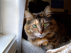
Look what happens when you crop it as a vertical, getting rid of the hot-spots so the kitty is the main event:

The overwhelming first impression at this crop is that the photo is more intimate. Fee is no longer relating to the window - she's relating to you. This has the effect of showcasing her personality. The side of her face appears brighter, and the triangle shape of her ears and chin is more obvious (geometrics are good! roll with them!). Additionally, the shot appears much cleaner than the original.
Notice also that I've left room around her - a hint of curtain to indicate the window and room for her whiskers so she isn't cramped.
Some photos are naturally vertical - like full length shots of humans. Some are naturally horizontal - almost anything where setting is really important is better as a horizontal. Look at the original Fee shot - the setting is much more important. In the cropped version, she is more important. Landscapes, cityscapes.
For your purposes, shoot some of both. When all else fails it's pretty solid to mimic the shape of your subject. If your cat is sitting up, that's a vertical shot. If your dog is laying down, that's a horizontal shot. (This is assuming you want to show all of the pet.)
As much as it pains me to say so, the cropped version of Fee's photo is much better.
Composition is the art of making a pleasing arrangement in your photographs. There are certain rules to follow, more or less six or eight of them that will really help you in a practical way. I'll get to the others eventually as I have time to shoot sample shots. Tonight we are talking about Cropping.
Cropping is sort of a way of framing your shot so that only the most important parts are present. Photography is a subtractive art, like sculpture. You get art by taking things away. In the case of sculpture, it's obvious - chip away everything that doesn't look like The Thinker and you've technically done a Rodin (forget his creativity for just a moment). In the case of photography, it's a little more difficult. Cropping is the art of taking away everything from an existing shot that doesn't contribute to the shot itself.
See, I was in love with that sunny window in the shot of Fee below because it was dramatic. I thought it was a horizontal shot because a cat laying down is a horizontal subject. But then I realized that window is the part of the stone that doesn't look like The Thinker.
Here it is, before:

I am purposely showing it to you small, because stepping back from your work often shows the flaws. Though the window IS bright and dramatic, it's taking some of the attention off the kitty's face. The hot corner of the blanket in the foreground also detracts.
Look what happens when you crop it as a vertical, getting rid of the hot-spots so the kitty is the main event:

The overwhelming first impression at this crop is that the photo is more intimate. Fee is no longer relating to the window - she's relating to you. This has the effect of showcasing her personality. The side of her face appears brighter, and the triangle shape of her ears and chin is more obvious (geometrics are good! roll with them!). Additionally, the shot appears much cleaner than the original.
Notice also that I've left room around her - a hint of curtain to indicate the window and room for her whiskers so she isn't cramped.
Some photos are naturally vertical - like full length shots of humans. Some are naturally horizontal - almost anything where setting is really important is better as a horizontal. Look at the original Fee shot - the setting is much more important. In the cropped version, she is more important. Landscapes, cityscapes.
For your purposes, shoot some of both. When all else fails it's pretty solid to mimic the shape of your subject. If your cat is sitting up, that's a vertical shot. If your dog is laying down, that's a horizontal shot. (This is assuming you want to show all of the pet.)
As much as it pains me to say so, the cropped version of Fee's photo is much better.
Labels: Fee, knitting, photography


3 Comments:
Thansk for the lesson! I'm looking forward to the other upcoming lessons too!
You're giving me the understanding of the why behind my intuitive way of working - thanks!
I'd also note that cropping (and even plain old resizing) are wonderful for getting pictures to load faster and saving storage space.
I have only just discovered the magic of croppingt - thanks!
Post a Comment
<< Home