
Altering things - a looooong post
I'm sorry for the lack of cool knitting content, I really am and I hope you'll put up with more artistic-type ramblings tonight. In addition to not making much progress on Glee, I cabled my Log Cabin Socks backwards, so I ripped back to the ribbing, and I have only done about four rows of my new sock. Which you wouldn't know anything about because I haven't told you - Conwy is on hold. I love the pattern, but the yarn? Not for socks. I am just trying to get up the courage to admit it to myself. Also, at work I am in the Land of 1,000 Meetings and I just finished a big freelance project. So, not a lot of inspiration going on!
But, tonight I was playing around in Photoshop and even though I'm real sad I didn't save my file with all the layers, I did save a composite of what I was doing. This is an adjusted picture of Fee, taken with daylight behind her. It's not a super-good shot, and my intention was to show you that so you focus on technique rather than on the shot itself. (More on that later.)
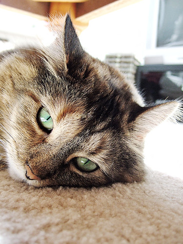
For you geeky techno-types, I took out a lot of saturation in the master, upped the greens, did a shadow/highlight adjustment that took out a lot of the extra midtone in the darker levels, did some selective colour adjustments in the reds, greens and blacks, and blurred out the background a little bit. Oh, and painted out the speaker.
That's a lot o words to basically say that I lightened the overall picture, turned up the contrast in some levels but pulled out the overall RGB totals in the blacks to remove the muddiness. Here is the original.
This photo has some obvious problems. The composition is decent, but the overall contrast level is too dramatic for the subject. She should be well-lit, but parts of her face are too much in shadow (that's the muddiness) and parts of the background are too different from the subject - too much contrast. Backgrounds are best when simple. In this photo we have some nice leading-lines from the table and shadow line sending you in to the center of the photo, but the books and speakers are distracting. The big black box (my behemoth, 1991 tv stand) is a distraction against all the white - a black hole.
So basically what you have is the inability to see the subject because of a distracting background and low-light on her face. With me? Because now I am going to explain it all! In great detail!
What I did to this photo is something you might end up doing with your wardrobe, your makeup or even your knitting - I simplified it. The first thing I did was look at it, overall, as an object. Not as a cat - as a rectangular photo. Right away you can see that the left-side of the frame (right side of kitty's face) is lighter than the rest. This would be interesting if dramatically lit, but draws all the attention to the outside of the frame (a no-no) and takes away from her eyes. Also, my kitty has orange brackets over her eyebrows, and I wanted them to be seen.
So, step one was to figure out the focus of the picture - what it is, and what I want it to be. Like I said - extrapolate. Do you want the shape of your sweater to be noticed (the fit), or the colorwork? Interesting how sweaters with a lot of stranded stuff on them tend to be drop-shouldered and boxy. The form isn't important - the color is. If the form is important, like on those cabled socks? Use a color that doesn't distract from the form; no variegateds, or one that is only subtly variegated.
Overall I had to lighten the parts in shadow. But simply lightening them up didn't take care of the muddiness. In a digital photo, that mud comes from a lot of colours all plugging in together. Basically what was happening (technically) was too much colour in all the channels. So I removed some of the overall saturation - the total colour in each channel. (Geeky!) This lightens the photo without giving it a cast and keeps the contrast going.
But I wanted those eyes to be the focus. So I pulled the overall photo down towards black-and-white, EXCEPT for the green in her eyes. (The lesson here is that in a field of neutrals, colors draw more attention. It's called simultaneous contrast. It's also why picture frames are usually black, brown or gray.)
When I got that all done, though, I thought the eyes looked garish. I wanted the same liquid-light feeling I was getting from the face to be in the eyes. So I knocked down the overall contrast level without graying the thing out by adjusting the intensity of the shadows down to where I liked it.
The effect, I think, is a little cold but feels like window light on a winter day. Remember, y'all, photos liiiiiie. They lie. Each of these photos tells a different story, but only one of them does it well. The adjusted photo is much more interesting, though I quite possibly like the colour better on the original. But because it's not a good shot to start with, it relies on technique to carry it. (That is not a place you want to find yourself - it's a gimmick.)
How can you relate this to knitting? Pick one thing to focus on in a piece. If you love the form, pick a simple colour. If you love the riot of colour, pick a fairly simple shape. To narrow down your color choices, start by picking one that doesn't work. If that navy (no matter how much you like it) just seems sort of overbearing next to your dove gray, try a middle-toned steel blue instead. Contrast is the difference between the lightest lights, and the darkest darks. Simplifying the contrast - narrowing it, really - helps a lot. Both photos of Fee are relatively low-contrast, with one tending to darks and the other to lights. The lighter one actually has more contrast on her face, but less contrast with the background.
(Tangentially, this affects makeup choices. Women with blond hair and porcelain skin (low contrast) simply can't wear bright makeup without looking clownish. Women with dark hair and pale skin (high contrast) need brighter colors because the difference is overwhelming. Ever wonder why dark-haired, pale-skinned women look fantastic in navy? And I look like a ghost in a navy shirt? I have fairly even contrast - eyes, hair and skin all relatively the same color. There are some things i just can't do. So I dye my hair darker and wear heavier eyeliner. Experiment! Try using your makeup a different way than you've done before, just to see what happens. You might be pleasantly surprised.)
Thank you for flying Random Airways, please remain seated until the captain has turned off the Fasten Seatbelt sign. :) Hope y'all enjoyed it.
But, tonight I was playing around in Photoshop and even though I'm real sad I didn't save my file with all the layers, I did save a composite of what I was doing. This is an adjusted picture of Fee, taken with daylight behind her. It's not a super-good shot, and my intention was to show you that so you focus on technique rather than on the shot itself. (More on that later.)
For you geeky techno-types, I took out a lot of saturation in the master, upped the greens, did a shadow/highlight adjustment that took out a lot of the extra midtone in the darker levels, did some selective colour adjustments in the reds, greens and blacks, and blurred out the background a little bit. Oh, and painted out the speaker.
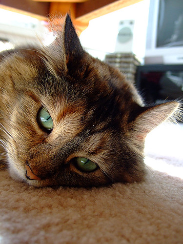
That's a lot o words to basically say that I lightened the overall picture, turned up the contrast in some levels but pulled out the overall RGB totals in the blacks to remove the muddiness. Here is the original.
This photo has some obvious problems. The composition is decent, but the overall contrast level is too dramatic for the subject. She should be well-lit, but parts of her face are too much in shadow (that's the muddiness) and parts of the background are too different from the subject - too much contrast. Backgrounds are best when simple. In this photo we have some nice leading-lines from the table and shadow line sending you in to the center of the photo, but the books and speakers are distracting. The big black box (my behemoth, 1991 tv stand) is a distraction against all the white - a black hole.
So basically what you have is the inability to see the subject because of a distracting background and low-light on her face. With me? Because now I am going to explain it all! In great detail!
What I did to this photo is something you might end up doing with your wardrobe, your makeup or even your knitting - I simplified it. The first thing I did was look at it, overall, as an object. Not as a cat - as a rectangular photo. Right away you can see that the left-side of the frame (right side of kitty's face) is lighter than the rest. This would be interesting if dramatically lit, but draws all the attention to the outside of the frame (a no-no) and takes away from her eyes. Also, my kitty has orange brackets over her eyebrows, and I wanted them to be seen.
So, step one was to figure out the focus of the picture - what it is, and what I want it to be. Like I said - extrapolate. Do you want the shape of your sweater to be noticed (the fit), or the colorwork? Interesting how sweaters with a lot of stranded stuff on them tend to be drop-shouldered and boxy. The form isn't important - the color is. If the form is important, like on those cabled socks? Use a color that doesn't distract from the form; no variegateds, or one that is only subtly variegated.
Overall I had to lighten the parts in shadow. But simply lightening them up didn't take care of the muddiness. In a digital photo, that mud comes from a lot of colours all plugging in together. Basically what was happening (technically) was too much colour in all the channels. So I removed some of the overall saturation - the total colour in each channel. (Geeky!) This lightens the photo without giving it a cast and keeps the contrast going.
But I wanted those eyes to be the focus. So I pulled the overall photo down towards black-and-white, EXCEPT for the green in her eyes. (The lesson here is that in a field of neutrals, colors draw more attention. It's called simultaneous contrast. It's also why picture frames are usually black, brown or gray.)
When I got that all done, though, I thought the eyes looked garish. I wanted the same liquid-light feeling I was getting from the face to be in the eyes. So I knocked down the overall contrast level without graying the thing out by adjusting the intensity of the shadows down to where I liked it.
The effect, I think, is a little cold but feels like window light on a winter day. Remember, y'all, photos liiiiiie. They lie. Each of these photos tells a different story, but only one of them does it well. The adjusted photo is much more interesting, though I quite possibly like the colour better on the original. But because it's not a good shot to start with, it relies on technique to carry it. (That is not a place you want to find yourself - it's a gimmick.)
How can you relate this to knitting? Pick one thing to focus on in a piece. If you love the form, pick a simple colour. If you love the riot of colour, pick a fairly simple shape. To narrow down your color choices, start by picking one that doesn't work. If that navy (no matter how much you like it) just seems sort of overbearing next to your dove gray, try a middle-toned steel blue instead. Contrast is the difference between the lightest lights, and the darkest darks. Simplifying the contrast - narrowing it, really - helps a lot. Both photos of Fee are relatively low-contrast, with one tending to darks and the other to lights. The lighter one actually has more contrast on her face, but less contrast with the background.
(Tangentially, this affects makeup choices. Women with blond hair and porcelain skin (low contrast) simply can't wear bright makeup without looking clownish. Women with dark hair and pale skin (high contrast) need brighter colors because the difference is overwhelming. Ever wonder why dark-haired, pale-skinned women look fantastic in navy? And I look like a ghost in a navy shirt? I have fairly even contrast - eyes, hair and skin all relatively the same color. There are some things i just can't do. So I dye my hair darker and wear heavier eyeliner. Experiment! Try using your makeup a different way than you've done before, just to see what happens. You might be pleasantly surprised.)
Thank you for flying Random Airways, please remain seated until the captain has turned off the Fasten Seatbelt sign. :) Hope y'all enjoyed it.
posted by Jen at 11:12 PM
![]()


4 Comments:
Mind bendingly cool! I rarely do more than crop my pictures, so this stuff is interesting to learn about.
Very cool. I have CS2 and ADORE IT!!! LOL Its as addictive as knitting lol
you should save your actions so we can play with them!!!
thank you for telling, I'll try to "play" and think more about my photo's.
Post a Comment
<< Home